Project Settings
Project settings are stored in the project database and apply to all users of the project. You may see different options in your database, as adding adapters to a V-Suite CORE project may add additional options. Project settings are read when a user opens the database. A user will not see changes made to project settings while a project is open until the next time he or she open that project.
|
Projects options are disabled if you work in the Production View. Authoring functions, including updating a project, are always performed against a work order or a standing task, and always in a Work In Progress (or WIP) view that until it is published, is only visible to users working in the work order or standing task. |

|
Modifying project settings requires that you belong to a role that has the appropriate access right. Authoring functions, including modifying project settings, are always performed against a work order or a standing task, and always in a Work In Progress (or WIP) view that, until it is published, is only visible to users working in the work order or standing task. |

|
Modifying project settings is not available when you have opened multiple projects. |

Startup | Labels | Marked Points | Units | File Locations | Display Filters | Selection | Region Grid | Transformation | Asset Naming | Printing Logo | Custom Help
Startup
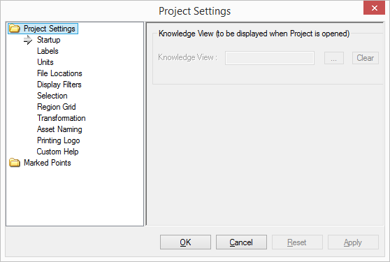
When a project is opened, V-Suite CORE will open the specified Knowledge View. To set this option, click on the browse button and select a Knowledge View. NOTE: This option will only work if the option is enabled in the General section of Local Settings (Tools - Options).
Startup |
|
Knowledge View |
Choose the Knowledge View to be displayed when the Project is opened. Clicking the browse button (...) will open the Knowledge View Browser dialog. Use the Clear button to remove the specified knowledge view. |

Labels
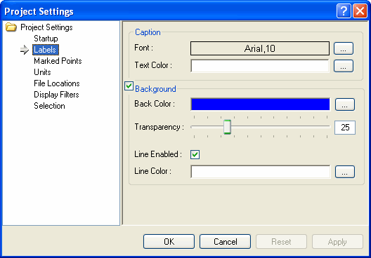
These settings control the default values for new labels created in the project and apply to all users. These options do not affect labels which have already been created. See Changing Label Properties for examples of labels with different properties.
Caption |
|
Font |
The default font used for new labels. Clicking the browse button (...) will open the Font dialog. The default font is 10pt Arial. |
Text Color |
The default text color used for new labels. Clicking the browse button (...) will open the Color dialog. The default color is White. |
Background |
|
Background |
Checking this option enables the background for new labels. The default is checked. |
Back Color |
The default background color for new labels. Clicking on the browse button (...) will open the Color dialog. The default color is Blue. |
Transparency |
The default transparency for new labels. When transparency is set to 100 the label's background is invisible. The default is 25. |
Line Enabled |
Checking this option enables the line around the outside of a new label. The default is checked. |
Line Color |
The default color for the line around the outside of a new label. Clicking the browse button (...) will open the Color dialog. The default color is White. |

Marked Points - Marker
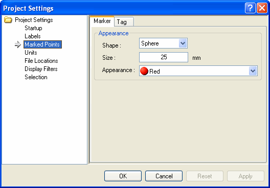
These settings control the default values for new marked points created in the project and apply to all users. If there are different types of marked points, such as Thickness Monitoring Locations (TMLs), these will be listed separately to allow having different initial values for all of the supported marked points. These options do not affect marked points which have already been created. See Changing Marked Point Properties for examples of marked points with different properties.
Appearance |
|
Shape |
The default shape for new marked points. Choose from a Sphere, Box, and Pyramid shape. The default is Sphere. |
Size (in mm) |
The default size for new marked points. The default is 25 mm. |
Appearance |
The default Appearance for new marked points. Choose from any of the Appearances that appear in the Appearance Manager. The default is Red. |
Marked Points - Tag
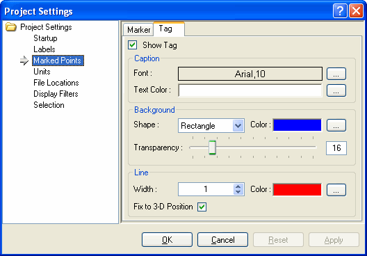
These settings control the default values for the tags belonging to new marked points created in the project, and apply to all users. If there are different types of marked points, such as Thickness Monitoring Locations (TMLs), these will be listed separately to allow having different initial values for all of the supported marked points. These options do not affect marked points which have already been created. See Changing Marked Point Properties for examples of marked points with different properties.
Tag |
|
Show Tag |
Checking this option displays a tag whenever a new marked point is created, see Displaying Marked Points for more information. The default is checked. |
Caption |
|
Font |
The default font used for new marked point tags. Clicking the browse button (...) will open the Font dialog. The default font is 10pt Arial. |
Text Color |
The default text color used for new marked point tags. Clicking the browse button (...) will open the Color dialog. The default color is White. |
Background |
|
Shape |
The default shape for the new marked point tags. Choose from a Triangle, Rectangle, Diamond, Pentagon, Hexagon, Ellipse or Sphere. The default is Rectangle. |
Color |
The default background color for new marked point tags. Clicking the browse button (...) will open the Color dialog. The default color is Blue. |
Transparency |
The default background transparency for new marked point tags. When transparency is set to 100 the background of the marked point tag is invisible. The default is 25. |
Line |
|
Width |
The default width for the line connecting the new marked point to its tag. The default is 1. |
Color |
The default color for the line connecting the new marked point to its tag. Clicking the browse button (...) will open the Color dialog. The default is Red. |
Fix to 3-D Position |
Checking this option will cause the tag to move with the model when navigating, and when unchecked the tag will remain in the same position on the screen, see Changing Marked Point Tag Behavior for more information. |

Units - General
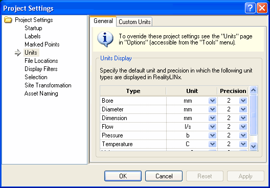
V-Suite CORE projects can be configured to display diameters and other dimensions according to project standards. The units of measurement are configured by project, thereby requiring all users to work in the same units.Other units can also be defined for use with attributes created in V-Suite CORE or imported from other design systems.
The user or project administrator can configure the units of measurement for different types of measurements. Also, the reported precision for different types of measurements can be specified. For example, if a precision of 2 is specified, then values will be reported in the form 123.45.
Units |
|
Bore |
The unit and precision with which to display bore values. The default is mm with a precision of 0. |
Diameter |
The unit and precision with which to display diameter values. The default is mm with a precision of 0. |
Dimension |
The unit and precision with which to display dimensional values, such as lengths and coordinate values. The default is mm with a precision of 0. |
Flow |
The unit and precision with which to display attributes of Flow type. The default is liters per second with a precision of 0. |
Pressure |
The unit and precision with which to display attributes of Pressure type. The default is bar with a precision of 0. |
Temperature |
The unit and precision with which to display attributes of Temperature type. The default is degrees Celsius with a precision of 0. |
Volume |
The unit and precision with which to display attributes of Volume type. The default is cubic millimeters with a precision of 0. |
Units - Custom Units
The user or project administrator can define custom unit types and associated units for a project. The Custom Units Tab lists all of the available units and allows the user to create new units, modify existing units and delete existing units.
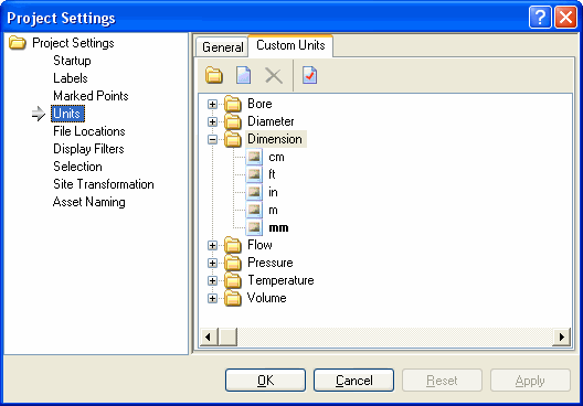
To create a new unit type:
- Click on the Create New Unit Type
 toolbar button.
 - In the Unit Type textbox, enter a name for the new Unit Type.
- In the System Unit textbox, enter a name for the System Unit for this Unit Type. This abbreviated name will be used in all displays.
- In the System Unit Full Name textbox, enter a descriptive name for the System Unit.
Note: When creating a new V-Suite CORE Project, it will include six Unit Types: Diameter, Dimension, Flow, Pressure, Temperature, and Volume. Diameter and Dimension are considered system unit types and cannot be edited or modified. System units are shown in bold in the tree and cannot be deleted once created.
To create a new unit:
- Select a Unit Type and click on the New
 toolbar button.
 - In the Unit textbox, enter an abbreviation for the new unit. This is the name that will be used in various controls throughout V-Suite CORE. It should not be more than four characters.
- In the Full Name textbox, enter the full name of the new unit.
- Conversion Factors- New units must be converted from the system unit for the selected Unit Type.
- Enter the value to multiply the number of new units by.
- Enter the value to add.
- Review the "conversion equation" to ensure that the conversion factors have been entered correctly.
To modify an existing unit type or unit:
- Select the unit type or unit to modify.
- Click on the Properties
 toolbar button.
 - Make edits in the appropriate field. The font of the labels of all edited fields will turn red.
- When modifying units, review the "conversion equation" to ensure that the conversion factors have been entered correctly.
- Click OK to accept and apply the modifications.
To delete an existing unit type or unit:
- Select the unit type or unit.
- Click on the Delete
 toolbar button.
|
System unit types, system units, units being used in the General tab or units being used by any attribute template cannot be deleted. |


File Locations
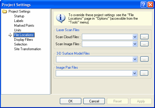
Specifies the path to Laser Scans Files, 3-D Surface Models, and Image Pair Files. To set the path, click on the browse button and locate the files. All subdirectories within the main folder are searched so a higher-level directory can be specified.
Note: Be sure that the specified directory is accessible to all users of the project.
File Locations |
|
Scan Cloud Files |
Specify a path which contains the scan cloud files. Clicking on the browse button (...) will open the Browse For Folder dialog which can be used to locate a path. |
Scan Image Files |
Specify a path which contains the scan image files. Clicking on the browse button (...) will open the Browse For Folder dialog which can be used to locate a path. |

Display Filter
Display Filters |
|
Appearance |
The default appearance to use when a display filter is created. (See Creating Display Filters for more information.) Choose from any of the appearances that appear in the Appearance Manager. The default is Gold. |

A user with the correct access right can change what gets chosen first in the Asset Explorer when the user clicks on an asset in the Asset View. Instead of the lowest object in the hierarchy being chosen by default, one of its ascendants is chosen instead. Subsequent clicks on the Asset will walk down the hierarchy. Once the lowest level is selected, another click will repeat the cycle. See below for an example.
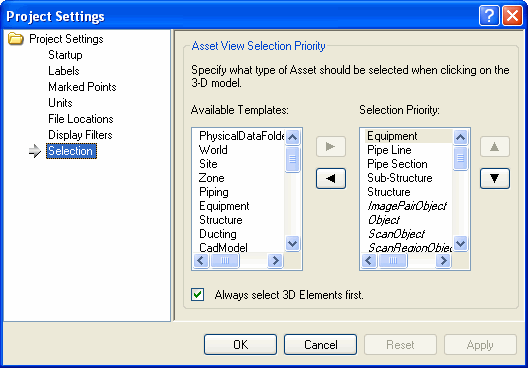
Asset View Selection Priority |
|
Available Templates |
Lists the Group-derived Custom Asset Templates defined in the Project. |
Selection Priority |
Defines the item that gets chosen first in the Asset Explorer when the user clicks on an asset in the Asset View. Object-derived templates, shown in italics, have default priority and cannot be rearranged. If an Asset Template listed in the priority is not found in the particular branch of the Explorer, then it will be skipped and the next available level will be chosen. |
Always select 3D Elements first |
Checking this option will ignore the selection priority and select the 3D Elements on the first click on the Asset View. |
When an asset is clicked in the Asset View the selection level is used to find an asset that matches the top-most priority template. In the below example, the asset selected is of template "Equipment", which is part of the selection priority.
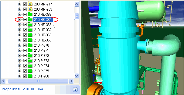
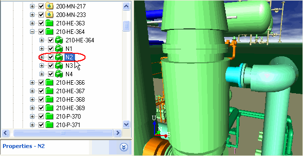
If you click again, the next level in the hierarchy is selected.
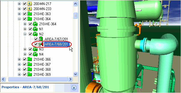
If you click again, the next level in the hierarchy is selected. Another click selects the asset in the first step shown above.

Transformation
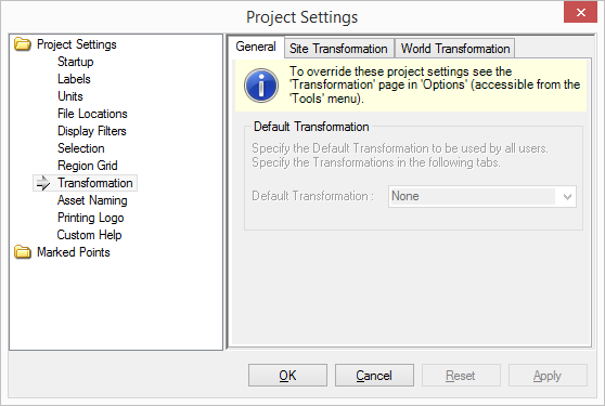
Specifies the Site Transformation and World (Survey Transformation) for the project. Site Transformation is recommended when the project needs to be place in site/facility coordinates and world transformationhe project to place the project in survey coordinates, such as state grid references.
Default Transformation |
|
Default Transformation |
Select the default transformation for the project. Select one off "None", "Site Transformation", "World Transformation" |
Site Transformation and World Transformation |
|
Custom Transformation |
|
Use a Custom Transformation if you have simple information about the new location of the model. |
|
Site Origin |
Specify the new site origin. |
North 1 |
Specify the new direction of the site transformation. |
North 2 |
Specify the new orientation of the site transformation. |
Best Fit Transformation |
|
Use a Best Fit Transformation if you used a series of points from the Best Fit Calculator to calculate a transformation. |
|
Rotation Point |
The point about which the model should be rotated.. |
Rotation Axis |
The axis at the rotation point about which the model should be rotated.. |
Rotation Angle |
The angle about which the model should be rotated. |
Translation |
The translation delta that the model should be moved. |

Asset Naming
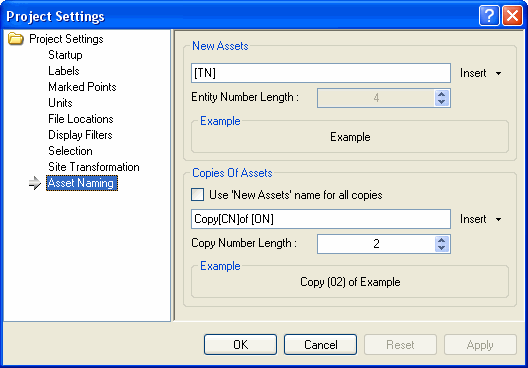
Specifies the defaults to use when naming new assets or copies of assets.
New Assets |
|
Insert Tags |
Insert any static text, such as dashes (-) or slashes(/), or any of the predefined tags to build the name of new assets. The following tags are supported: [EN] - Entity Number. Inserts the child number in the name of the asset. [TN] - Template Name. Inserts the template name into the new name. [UD] - User Data. Inserts whatever the user has defined in his/her Options. [UN] - User Name. Inserts the user name of the current user. This only applies when the project is being opened from the server. The default is to only use the template name. |
Entity Number Length |
The length of the entity number tag. This is only enabled if the name will contain the Entity Number [EN]. For example, if this is set to 4, the first asset will be named "Asset-0001". |
Example |
Shows how the name of the new asset will look like based on the rules. |
Copies of Assets |
|
Use 'New Assets' name for all copies. |
Checking this option will treat any copies of assets as new assets and will use the 'New Assets' rules when naming assets that are copies of other assets. The default is not checked.. |
Insert Tags |
Insert any static text, such as dashes (-) or slashes (/), or any of the predefined tags to build the name of assets that are created by making copies of already existing assets. The following tags are supported: [CN] - Copy Number. Inserts the copy number into the name. [ON] - Original Name. Inserts the original name of the copied asset. The default is to name copies as Windows does. For example making the second copy of an asset named P-101, would result in "Copy (02) of P-101". |
Example |
Shows how the name of the copied assets will look like based on the rules. |

Region Grid
Specifies the values used to construct the Region Grid.
Asset View Selection Priority |
|
Origin |
The origin of the region grid, which will define the X, Y, Z indexes of the Laser Scan Regions, and from which point the region grid will anchor. |
Region Size |
Defines the item that gets chosen first in the Asset Explorer when the user clicks on an asset in the Asset View. Object-derived templates, shown in italics, have default priority and cannot be rearranged. If an Asset Template listed in the priority is not found in the particular branch of the Explorer, then it will be skipped and the next available level will be chosen. |
Asset View Selection Priority |
|
Distance Threshold |
The distance needed for points in a region to be considered two unique points, and not a single point. |
Printing Logo
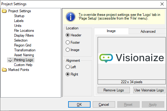
Logo |
||
Location |
Header |
Select this radio button to print the logo image in the header. |
Footer |
Select this radio button to print the logo image in the footer. |
|
Image |
Select this radio button to print the logo image integrated with the image. |
|
Alignment |
Left |
Aligns the logo image to the left of the header or footer. |
Right |
Aligns the logo image to the right of the header or footer. |
|
Top Left |
Aligns the logo image to the top left corner of the image. This option is only available when the Location is set to Image. |
|
Top Right |
Aligns the logo image to the top right corner of the image. This option is only available when the Location is set to Image. |
|
Bottom Left |
Aligns the logo image to the bottom left corner of the image. This option is only available when the Location is set to Image. |
|
Bottom Right |
Aligns the logo image to the bottom right corner of the image. This option is only available when the Location is set to Image. |
|
Image |
Image |
Click on the image itself to change to a different logo. All image file types are supported. |
Remove Logo |
Click on the button to clear the image and not print out a logo. |
|
Use Visionaize Logo |
Click on the button to reset the logo to the default Visionaize image. |
|
Logo - Advanced |
||
Advanced |
Enable Transparency |
Check this box to treat one of the colors in the specified image as transparent. |
Transparency Color |
Click on the box to invoke the color palette and choose which color in the specified image to treat as transparent. Only available if transparency is enabled. |
|
Size |
Adjust the size of the logo image on the page. |
|
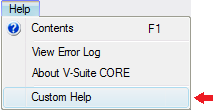
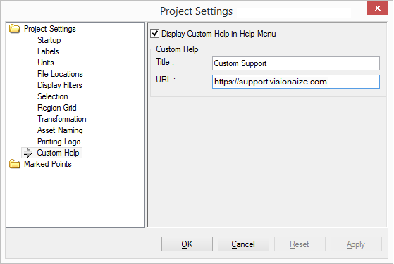
Custom Help
Custom Help |
|
Display Custom Help in Help Menu |
Check this option to display a custom help link in the help menu. |
Title |
The title of the menu item. |
URL |
The URL of the web page to be displayed when the user selects the custom help item. |
Example: